
A central observability team manager wants their system to be valuable to developers and SREs, easy to navigate, and efficient even as their data grows and changes. They often end up with a long list of high-volume metrics currently running through their system and wonder which ones are useful and which ones are clutter.
To solve this problem, the observability manager looks at a few dashboards and asks around in different teams. Some metrics seem to be in many dashboards, but it’s hard to get the same answer across multiple teams about their value. What is useful to one team is not useful to another.
In another case, individual developers across many teams mention the same specific metrics, but the observability team notices that they aren’t used in any dashboards or monitors — should they be? If so, why aren’t they in those dashboards today? Who last opened that one related dashboard — maybe they will know?
Everyone tells the observability team that they can’t live without all of their kube-state-metrics, but those represent a ton of volume in the system! How can the observability team simplify the data that their teams use? And do their teams really need all of those instance labels on the ksm output?
Additionally, how much should the observability team trust someone who says “Oh we never use that one metric, you can let it go.” Then, too often, next week that same person turns around to ask where it went because it is the one useful metric they need to solve a high-priority issue!
The Telemetry Usage Analyzer is a new way for observability teams to easily view cost and usage information side-by-side to make smarter metric traffic shaping decisions that reduce noise and boost signal.
Who is using this data and what do they use it for?
Observability system managers need information about data volume (data points per second) and data usage (who uses the data, where, and for what purpose). This context lets them make confident decisions about what high-signal data should be kept, publicized, and invested in, and what data can be rolled away, dropped, or ignored.
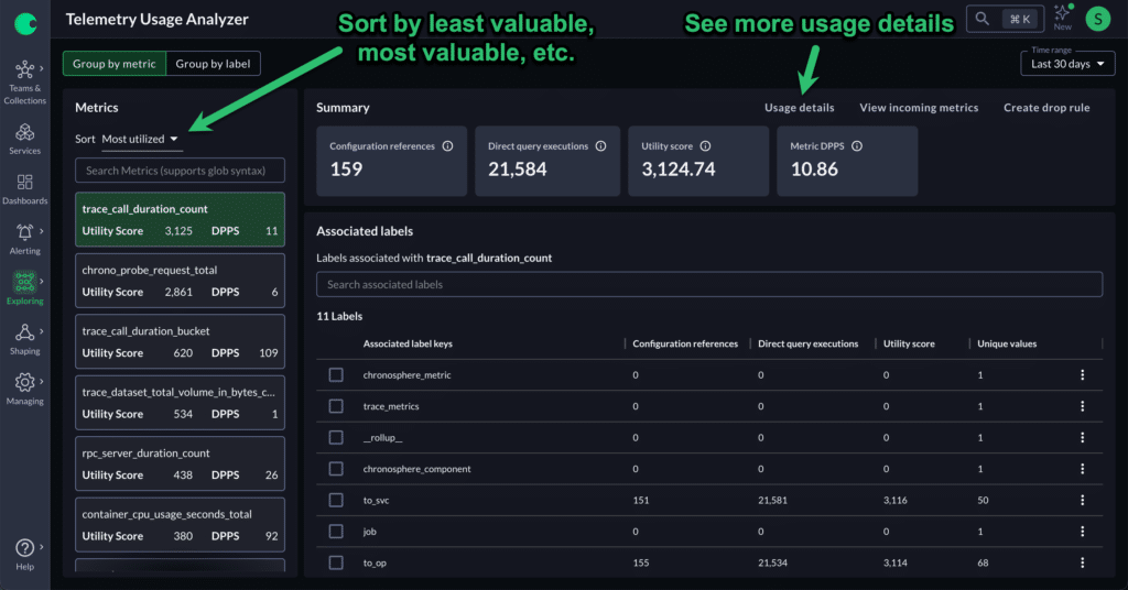
The Telemetry Usage Analyzer allows users to view all of their metrics and labels in Chronosphere ranked from least-used to most-used, alongside information about each metric’s/label’s volume (as measured in data points per second) and cardinality.
Users can quickly sort the list to find un- or little-used metrics/labels that they can drop or roll away. They can also identify what metrics users look for with Chronosphere’s Metric Explorer (a tool that helps users investigate query requests, responses, and query statistics), even if those metrics/labels aren’t in any dashboards or monitors. They can then decide whether to add them into dashboards and monitors to ensure that they are more widely used.
Defining data usage
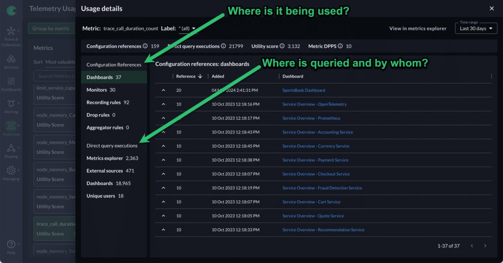
There are multiple reasons metrics/labels are highly utilized. For instance, they may be in dashboard or monitor configurations. Users may access dashboards and/or monitors frequently or infrequently. The metric/label may not be in any dashboard, but it may be something that users actively search for as part of a debugging workflow. It may be an important component of a shaping rule, such as an input to a rollup rule or a recording rule. Finally, a large volume of knowledgeable developers, team leads or SREs may use the metric/label.
The Telemetry Usage Analyzer captures all of this information about every metric and label. It tells you where the metric/label is being used, how frequently, and within what service or by which users.
It captures this data on a longer time-frame as well due to the cyclical nature of metrics/labels usage — you can select either a 14-day (sprintly) usage data window, or a 30-day (monthly) usage data window, to capture metrics that are only used during release cycles and ensure you don’t accidentally underestimate the utility of metrics/labels that are only occasionally useful.
Questions that the Telemetry Usage Analyzer can answer
The Telemetry Usage Analyzer can help observability managers and team leads with a variety of different workflows. It can help address the following questions:
What don’t my developers need?
In the Telemetry Usage Analyzer, you can sort metrics/labels and identify ones that are unused, or infrequently used, and see the volume they represent in your system — and decide if you want to let them go.
What aren’t my developers using, that they should be using?
As you browse through the Usage Analyzer, you may see metrics with unusual usage patterns. For instance, a metric may see frequent queries, but they’re all from a single user. Why? Perhaps that metric is new and valuable and other teams don’t know that they can use it yet. Here, you can quickly reach out to all of your team leads and let them know they can take advantage of this new metric!
Or, perhaps a user doesn’t know that a different dashboard exists with an aggregated version of a metric, that is more performant than the current query they use. You can direct them to the new dashboard and then, if no one else is using the original metric, go ahead and let it go so that you don’t have to store the less-relevant data.
What do people need that I’m not providing?
The Telemetry Usage Analyzer’s Metrics Explorer information also shows metrics that your teams are looking for, but that have no presence in your system. These may be metrics that users would love to have! You can take this data and reach out to users to offer alternative metrics or let them know what is still in the system.
Summary
The Telemetry Usage Analyzer gives Chronosphere users full insight into the metrics data usage whether by dashboard, monitor, shaping rule, or query execution. This insight means users can more confidently identify unused data, make decisions about their metrics data shape, and communicate to users the impact of a proposed shaping rule.