")


Chronosphere launched the Query Builder in Fall 2021 to help customers quickly and simply create PromQL queries without the need for expert knowledge of the Prometheus Query Language.
A year later, in the Fall of 2022, along with Prometheus co-founder and creator of the original Query Builder prototype (PromLens), Julius Volz, Chronosphere returned the tool to the open source community. The goal was to have all levels of PromQL users use a powerful tool that gets them the data they need faster.
As with any query language, PromQL has an underlying data model you must learn and specific syntax to follow, which is not always easy to understand without practice. PromQL queries, for example, start by specifying the metric name, then allow for filters based on label values, and then allow for aggregation with various functions. While there are only four metric types, the variations are infinite (that is both the power and the challenge of PromQL) with this nested metric and function model.
This how-to takes you from ground zero with query building to fantastic visualizations that help you recognize symptoms of major application problems. With the right workflows, you can dissect major issues within your systems and have confidence in your observability practice.
Stage 1: Ground zero
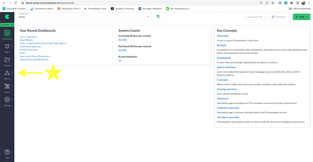
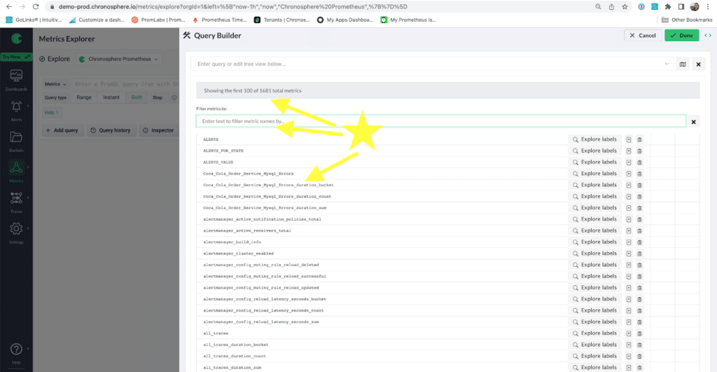
Ground zero is where you have zero insight into your data. You want to know what metrics you have in your system and take what data is there and start building with PromQL. There are a couple ways to get to Query Builder in Chronosphere. The first way (Image 1) is to click into the Metrics Explorer on the side panel. If you are hoping to build dashboards, then go to Dashboards, and start by adding a dashboard. Once in the new dashboard, the second way is to add a new panel and click Edit Query Builder to begin writing a query.
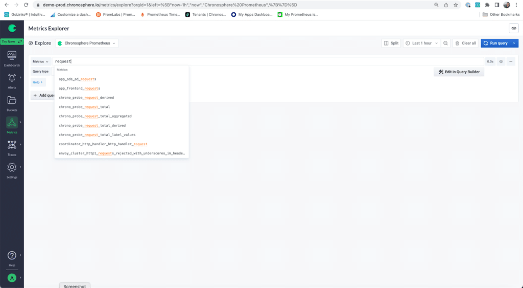
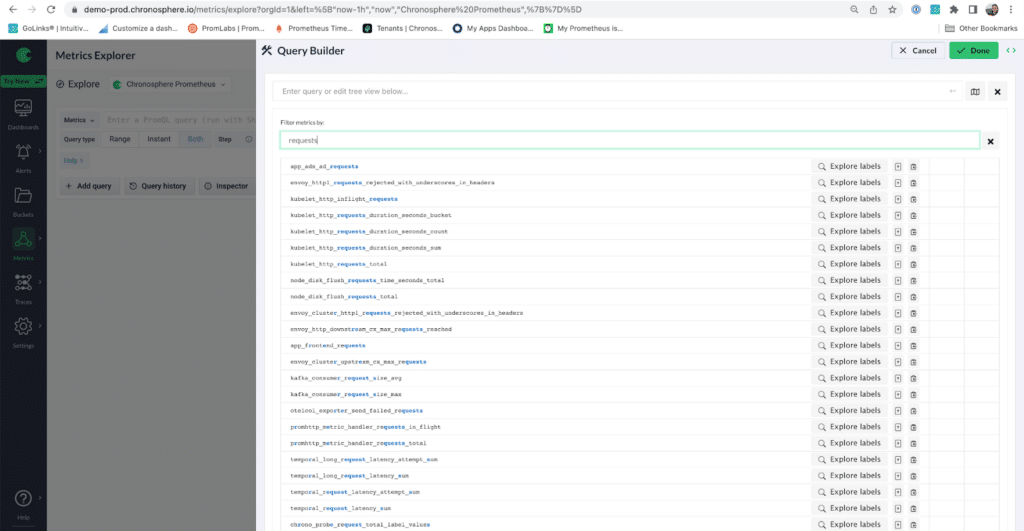
With Metrics Explorer, if you know what metrics you want, you can just start typing the metric you will base your query around. But Query Builder can also help you if you don’t know or just have a vague idea of metrics you want to explore. Let’s say I am looking for a request metric (maybe your team needs to know how many requests are failing or taking too long). Once I start typing, I see a pull down menu of potential metrics I want to work with. (Image 2)
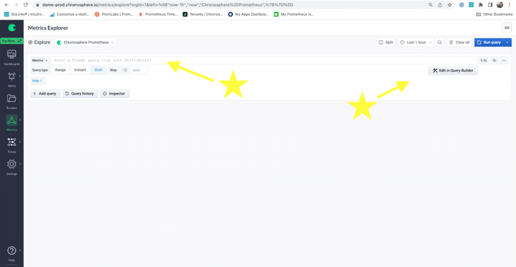
Next, let’s click Edit in the Query Builder to open the Query Builder. (Image 3)
Stage 2: The Query Builder
The brilliance of Prometheus metrics is that they are simple but robust. There’s an ability to do a lot with a little because most metrics have various labels that capture further details. Request metrics usually have methods and status codes associated with them, but to be sure with what labels we have to work with, I turn to the Query Builder to get specific information.
There are a few places you can look at within Query Builder to further orient yourself to the metrics and their labels you have to work with. First place, if you know what metric you need, you can type it in to get a table view (see the three tabs, use them to alternate how you want the metric data displayed) as well as performance info on all the attached labels.
Another place to go is the Start Query button that gives you an option to play around with PromQL directly or play around with what I will call the ‘elements’ of PromQL in ‘Form’. Then, choose your options and jump to the correct workflow: PromQL or Form.
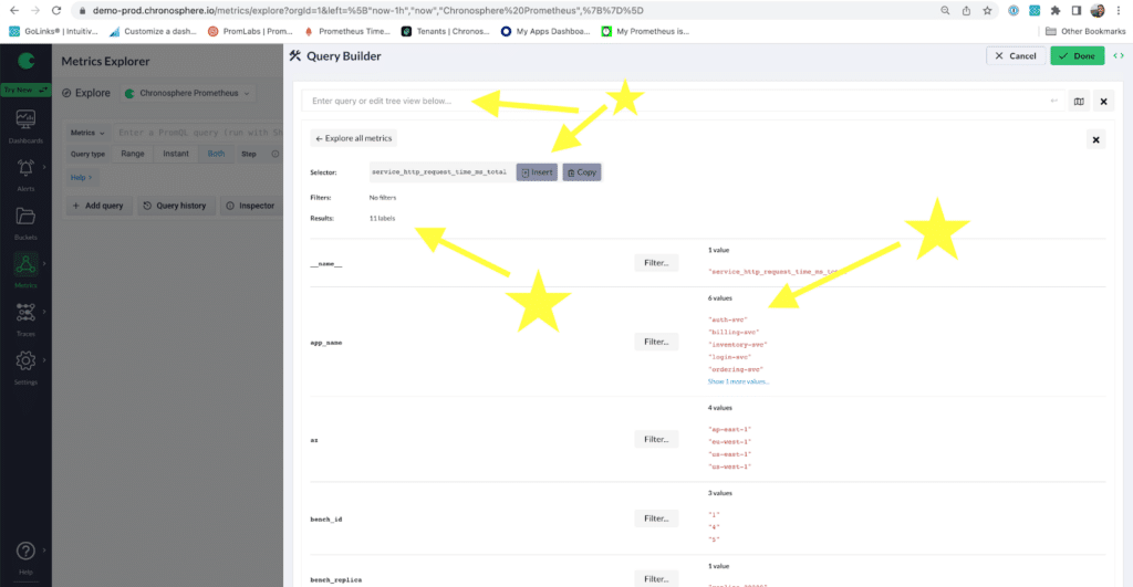
The third is the Map icon to see all Metrics available and if you click into Explore Labels you can see the unique label values as well as the count of labels you have to work with.
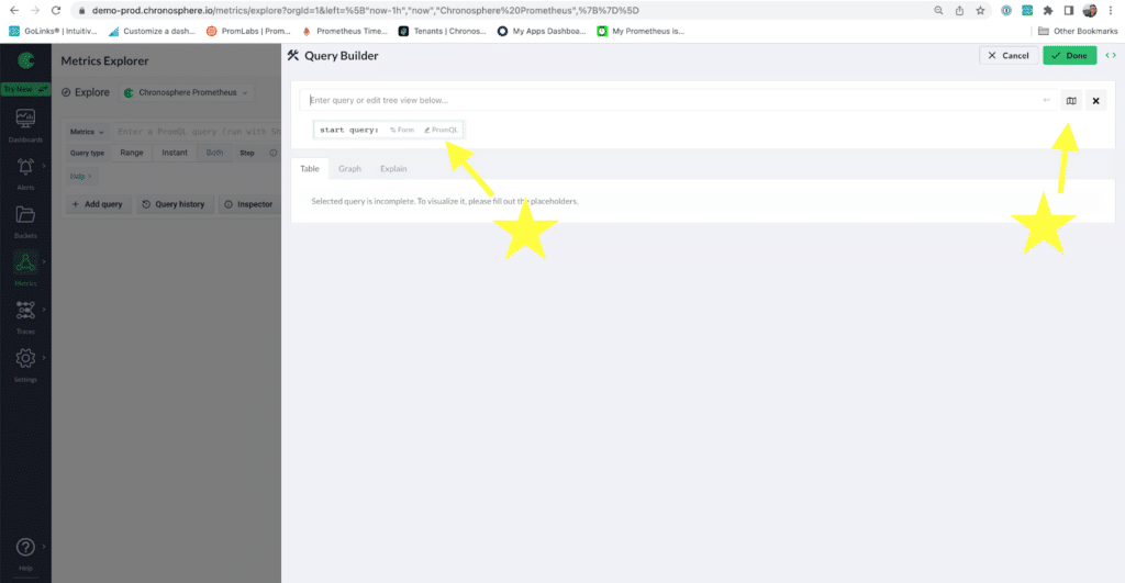
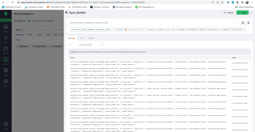
The following paragraphs will go through a PromQL workflow using various elements of the query builder to get a solid visualization on the amount of http_requests coming in that your team wants to track. (Image 4)
Workflow 1: PromQL
Step 1: Find the metric(s) you want in a few clicks
Here, I suggest going to the Map icon underneath the green Done button. This lets you see all your metrics and give you some great information to start with: How many labels each metric has and how many unique values each label has. You can see what is coming in and fuzzy search for the metric you want.
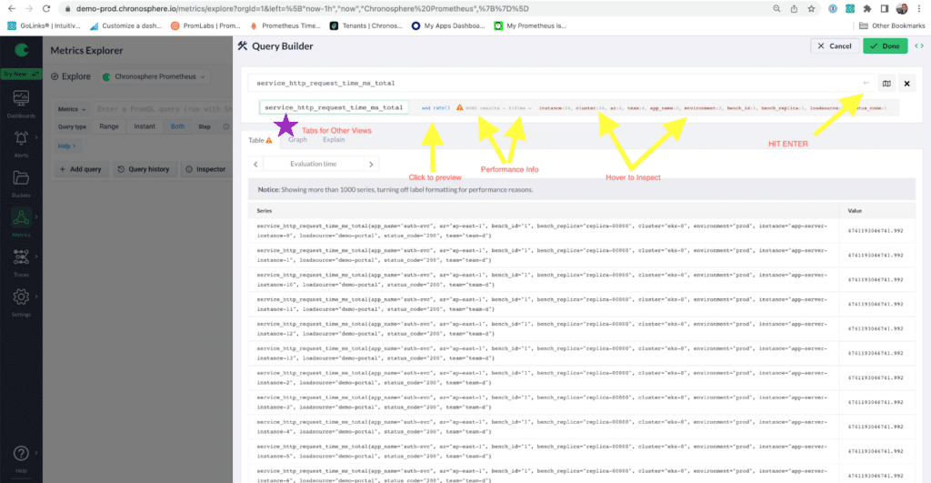
Below (Images 5-8) is a workflow to look for some ‘request’ metrics. I can find the service request metric I want to add to my query and if I click Explore Labels, I can see how many labels it has and then how many unique values. Looks like my service_https_request_time__ms_total is tied to six different applications.This is starting to look good for me. If I want to know how long different application requests take, I can ‘insert’ this metric into the text box up top and get the PromQL metric I need to work with; it wasn’t that many clicks!
Step 2: See the raw data and filter it
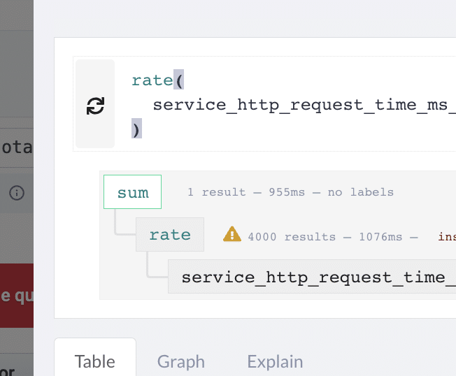
It looks like I have 4000 results for our metric service_https_request_time__ms_total. This data is OK. There’s a lot to parse through in the query builder and along with seeing how many results are returned; how long it took to get those metrics; and all the attached labels (if you hover you will see each label and how many metrics have each of those values), there is a suggestion to add a rate to see the change over a specified amount of time.
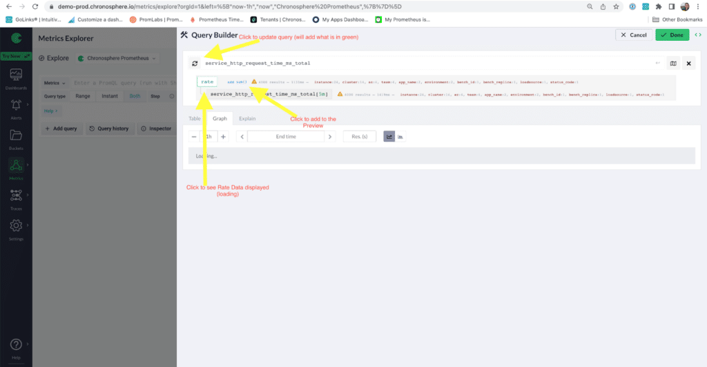
The Query Builder time interval default is 5m. Note that this rate will be a per second average of the metric over 5 minutes. Because I know this metric is a counter, a rate tells me more information about what is happening in my applications. Rate of change will let me know if there are spikes in requests and let me capture seasonality of any requests (aka if they are higher in the afternoon than early morning). In the Query Builder, once I click Rate, I get new performance info and a new suggestion to add a sum in blue; we will talk about sum shortly.
Here is where the Query Builder can get tricky. If you click service_http_request_time_ms_total[5m], you will get those metrics. If you click the green Rate box, you will get the rate of that metric averaged per second over that 5 minute interval.
It’s not completely obvious that this is how it works and note it does not automatically update the query in the top white text box — to do that you have to click the top refresh button and that will ‘save’ the query in the topmost box. If you are happy with what you have, the green done button is the place to click. Though I am not done (4000 results is not going to help me or give me enough info for me or my team. I’m going to keep drilling down).
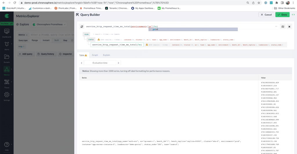
Since there are too many results, I’ll filter these metrics to the production environment. Unfortunately, you must type out the label (no easy way to click and add from red links — only blue — or green). But there is a helper tool that can select the right labels and values once you start typing (Image 11).
Once I filter to my production environment, I hit Enter and see new data. When I do, I still find my results are still too big for my purposes. I then check out the values on the team label and decide to filter down to ‘team-d’ ** (Image 12). Ahh. My results are in the hundreds! Let’s keep playing to get my total requests to something I want to use for a dashboard or as a baseline.
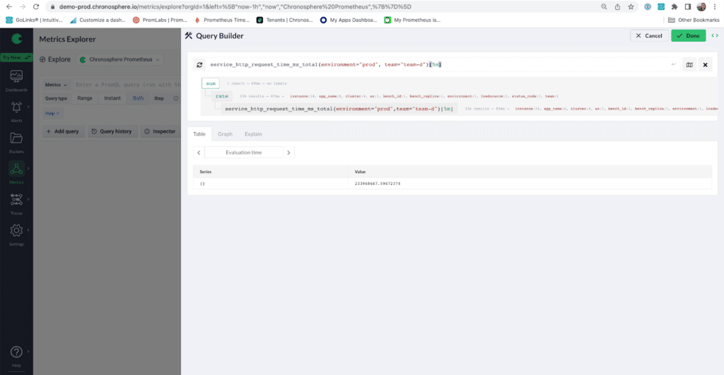
Note the difference in displayed data between Images 11 and 12. One image shows the results of the rate with multiple vector values for each series, while the other shows me a sum of all those series and vectors. Note that there is nothing in this Query Builder view to tell you what is what with regards to these views of results.
Query Builder assumes you know what you clicked and what the appropriate resulting value is. I like to think the Query Builder is slowly training you to think in Prometheus metrics, which require you to balance some basic metric types while you use them. Sums will sum up series. Rates will give you instant vectors of the per second average of the range interval added to the metric. Adding range intervals to metrics will give you range vectors. Remember there are lots of ways to slice and dice time series data!
If you want to preview your data, add it to the working PromQL text box by hitting the Refresh button on the left hand side (Image 13). Even if you play around in the gray boxes, don’t forget to save good queries! Query Builder does not automatically match the top text box to its tree view below — what is saved in that top box is ultimately what will show up in your dashboard panel or the Metrics Explorer — so play carefully.
Step 3: Playing with queries
Regarding my earlier use case: I am trying to effectively represent a requests metrics to my team. I realize it might be helpful to filter to the production environment, but using other labels, I see that I have other helpful ways to filter my data. I decided to focus on my team and further filter my query by my team (team-d). (Image 14)
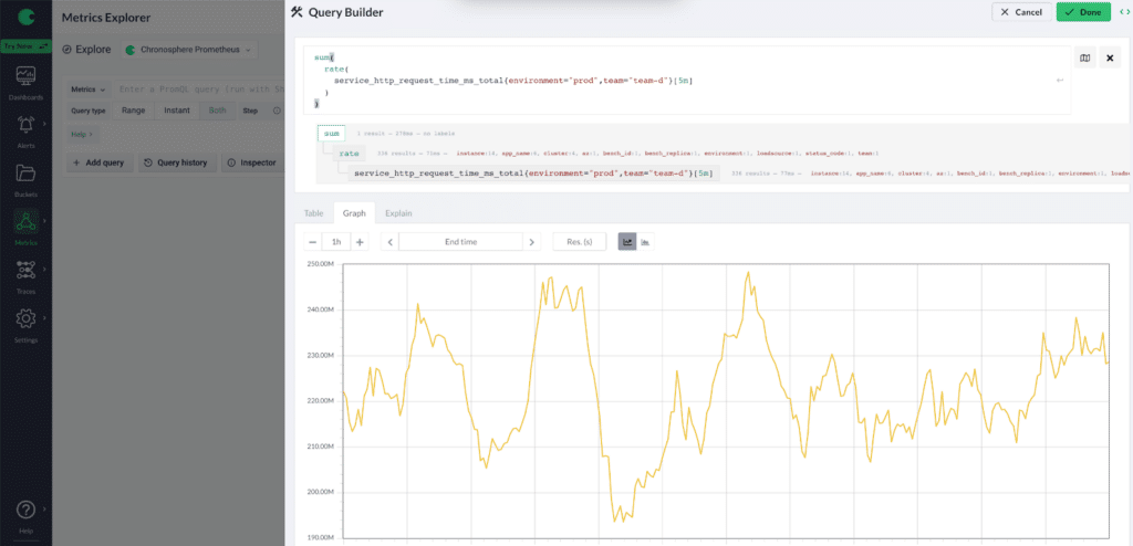
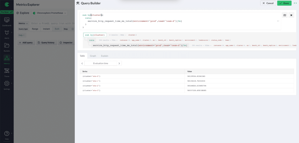
This is somewhat helpful. I can see spikes, and maybe capture some cyclical trends when apps make calls. However, I think I need to better break down the data and try summing by cluster to see the most used resources. To sum by cluster I add a by (cluster) clause after sum to my query. (Image 15)
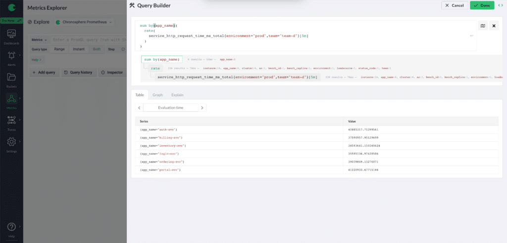
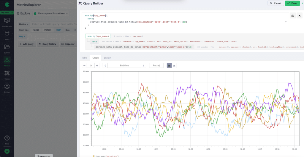
This still isn’t quite what I am looking for; I decide I want a breakdown by the various apps instead. To do that, I change my sum by clause to sum by (app_name) in the top query box. This addition looks good and will enable my team to do some great observability deep dives.
I then check out what it looks like in graph form, and start feeling pretty confident that I am on the right track and that I am cooking with gas with these metrics. (Image 17)
I’m now confident the Query Builder can get me to a good place with my data. I can start seeing the what and the where of my metrics. If you have clicked into the Query Builder from Dashboards, you can hit Save on your panel and start playing with visualizing more metrics. Otherwise you must copy the query from Query Builder and paste into a dashboard panel or even an alert condition.
Alerts is a whole other topic, but Query Builder is great at seeing what the data will look like and seeing baseline behavior for any future anomaly detection. The nice thing about all these queries is that it works at scale! We are dealing with high cardinality time series data at scale, but efficiently and with power.
In conclusion, there’s a lot more to do with these queries once you fine-tune them in the Query Builder. In a dashboard, I could add variables for the environment and team labels. Then use the variable drop down box to switch between values and correlate data even faster. This is only the start. Congrats, you have successfully used the Query Builder to build out helpful Prometheus queries!
Interested in how Chronosphere can help you manage your Prometheus instances? Contact us for a demo today.