Observability dashboards are powerful tools for visualizing and monitoring the health and performance of your business systems and applications. When designed intentionally, they provide critical insights at a glance and enable data-driven decision-making. However, poorly designed dashboards can lead to confusion, information overload, and missed opportunities. Let’s explore best practices for creating and maintaining effective observability dashboards, along with when to use them and potential pitfalls to avoid.
The challenge with dashboards
Dashboards often face criticism: there are too many, they don’t answer the right questions, or they’re difficult to interpret. Users can spend excessive time decoding visualizations or determining if the presented data warrants further investigation. Despite these challenges, industry insights reveal that nearly 70% of page views in observability systems are on dashboards. This statistic underscores that users still heavily rely on dashboards for guidance, even if their experiences are sometimes suboptimal.
Let’s explore how to enhance these crucial assets, by first walking through the pitfalls of poorly designed dashboards and then lay out the key elements that can transform them into an exceptional dashboard experience.
What makes a bad observability dashboard?
While dashboards are essential tools for observability, not all dashboards are created equal. Understanding what constitutes a poor dashboard experience is crucial for improving our overall observability practices. By identifying common pitfalls, we can learn to avoid them and create more effective, user-friendly dashboards.
Here are three key ways dashboards often fall short, and how these shortcomings impact the user experience.
1. Too many Dashboards!
A bad dashboard experience often begins before you even view the dashboard itself. Imagine logging into your observability platform, eager to find insights, only to be met with a chaotic array of dashboards with no apparent organization. This lack of logical grouping or categorization can quickly lead to user frustration. Compounding this problem is often a subpar search functionality due to the inconsistent naming conventions for the dashboard. This makes it difficult for users to quickly locate dashboards they need and also makes it challenging to identify the purpose of each dashboard.
2. Difficult to Interpret
A common mistake is information overload, where dashboard creators, in their enthusiasm to provide comprehensive data, cram too many metrics or visualizations onto a single screen. This approach, while well-intentioned, often results in cognitive overload for the user, making it difficult to extract meaningful insights.
Equally problematic is the lack of context in data presentation. Metrics displayed without benchmarks or historical data for comparison are like numbers in a vacuum – they fail to tell a story or guide decision-making effectively.
Poor visual hierarchy is another design flaw that can significantly detract from the dashboard experience. When dashboards fail to emphasize the most critical information, users may miss key insights or waste time searching for the most important data points. Inconsistent design elements, such as mismatched colors, fonts, or chart types, can create visual confusion and make the dashboard less intuitive to use.
Users expect their dashboards to be generally snappy and reactive. There are of course considerations for when long time ranges or a very expensive query is run to be visualized. But as a general rule of thumb, a responsive dashboard allows users to be able to scan and explore more effectively. The number of open panels that are open at once can cause for laggy interactions and thus should be taken into consideration.
3. Answering the right questions?
A dashboard that doesn’t enable users to take action based on the information presented is ultimately ineffective. This can manifest as:
Just like we hear location, location, location when trying to purchase a property, dashboards are all about context. You may have the most meaningful visualization but it doesn’t mean much without the context around that visualization.
Not having clear benchmarks or thresholds is a clear avenue for ensuring that your users will not be able to easily make sense of the numbers presented in your charts especially when it requires a level of action.
Not understanding the events or alerts that are taking place from deployments to other business events is a large gaping hole in terms of context. These are absolutely critical for someone to better understand trends or anomalies that they may be seeing in their visualizations.
O’Reilly Book: Cloud Native Observability
Master cloud native observability. Download O’Reilly’s Cloud Native Observability eBook now!
Dashboard Before and After
Let’s put these practices into action by looking at the following dashboard:
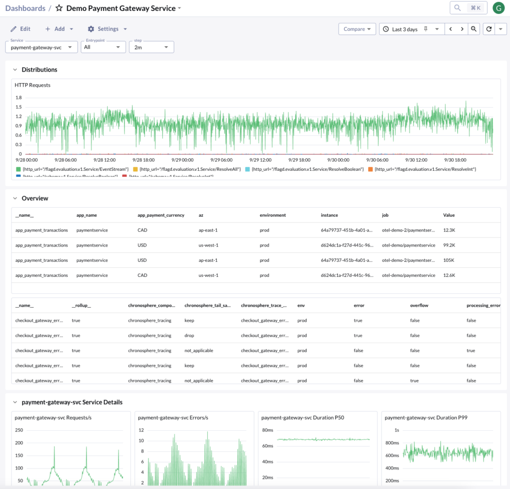
Here is a dashboard for a payment gateway service and there a few things that should strike someone on why it’s a suboptimal dashboard:
- Information Overload:
- The dashboard is crammed with too much information, making it difficult for users to quickly identify critical metrics. The large table in the middle, for instance, contains a lot of raw data that could be better summarized or visualized.
- Poor Visual Hierarchy:
- There’s no clear visual hierarchy to guide the user’s attention to the most important information. All elements seem to have equal weight, making it challenging to distinguish between critical and secondary data points.
- Lack of Context and Actionable Insights:
- The graphs and tables provide raw data but lack context. For example, the HTTP Requests graph doesn’t indicate what constitutes normal or problematic levels. There are no clear thresholds or comparisons to help users understand if the current values are good or bad.
What makes a good observability dashboard?
Now that we’ve talked about what makes up bad dashboards, we do want to talk a bit about how we expect users to be utilizing dashboards. To truly appreciate what makes a dashboard effective, let’s consider a common scenario:
Imagine you receive an alert about a possible performance regression in your system. You quickly navigate to your observability platform, and within seconds, you’re directed to a well-organized array of relevant dashboards. The consistent naming and clear categorization immediately guide your eye to the “Performance Overview” dashboard.
As you open the dashboard, you’re presented with a clean, focused view of key performance metrics. The layout is intuitive, with the most critical information prominently displayed. Clear visualizations show performance trends over time, with the recent regression immediately apparent. Contextual information, such as deployment markers and historical benchmarks, provides instant insights into potential causes.
With just a few clicks, you can drill down into more detailed metrics, filter by specific services or regions, and even access relevant logs – all without leaving the dashboard. This seamless experience allows you to quickly diagnose the issue, saving valuable time and minimizing the impact on your users.
This scenario illustrates several key attributes of a good dashboard:
- Logical organization and clear, consistent naming conventions for easy discoverability
- Intuitive layout with a focus on the most important metrics
- Contextual information to aid in decision making
- Ability to easily drill down for more detailed analysis
By embodying these principles, a good dashboard becomes more than just a data display – it becomes a powerful tool for rapid problem-solving.
Leveraging pre-configured experiences
We absolutely do not expect users to be spending all their time creating new dashboards as part of their observability experience on a daily basis. In an ideal dashboard experience, pre-configured views and vetted dashboards play a crucial role. These out-of-the-box solutions, whether provided by the observability system itself or created as organizational standards by a central team, offer a valuable starting point for users. They encapsulate industry and organizational best practices, ensure consistency across teams, and provide immediate access to relevant data without the need for extensive setup or design work.
Users should spend considerable time with these pre-configured experiences. They serve as an excellent onboarding tool, introducing key metrics and data relationships in a standardized format. For many common use cases, from daily monitoring to high-level executive overviews, these dashboards often suffice without any modification. They create a shared language around data, facilitating better communication and alignment across the organization.
Customize dashboards as needed
However, as users develop specific questions, they may need to go beyond pre-configured views. The observability system should provide a seamless way for users to transition from these standard dashboards into more detailed exploration. This capability allows teams to build custom dashboards tailored to their particular needs, creating more targeted and actionable insights.
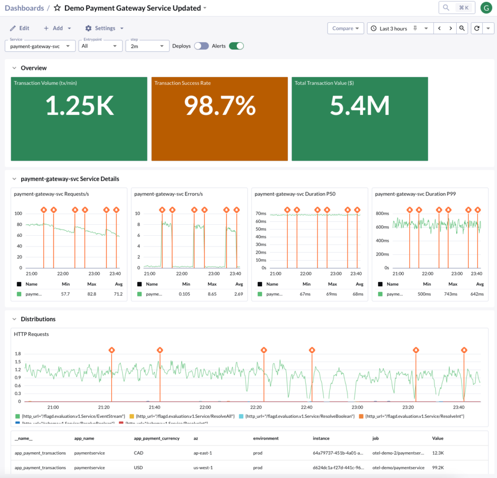
Here is an improved version with a few but important changes:
1. Clear Visual Hierarchy:
a. The dashboard now has a clear structure with an “Overview” section at the top displaying the most critical metrics.
2. Simplified and Focused Information
a. The dashboard has been streamlined to show only the most relevant information.
3. Context and Actionability:
a. The dashboard now includes markers for deployments and alerts (visible in the top bar), providing context for any changes in metrics. This helps in quickly correlating performance changes with system events.b. There are also thresholds to understand relative normal or problematic levels.
By avoiding these pitfalls and following best practices, you can create observability dashboards that provide genuine value to your organization, enabling faster issue resolution, better decision-making, and improved overall system performance. Here is a checklist to utilize for future dashboard endeavors.
Observability Dashboard Checklist
Dashboard Overview
- Can you understand the dashboard’s purpose at a glance?
- Does the dashboard seem overwhelming?
- Is the default time range appropriate for the data
Data Visualization and Hierarchy
- Are the most critical metrics or KPIs prominently displayed at the top?
- Does the flow of information make logical sense (e.g., from high-level to detailed)?
- Are the right types of charts used for each metric (e.g., line charts for trends, bar charts for comparisons)?
- Are colors used consistently and meaningfully?
Context and Actionability
- Are all panels and panel groups clearly labeled?
- Are there clear thresholds or benchmarks to interpret the data?
- Are important events (like deployments or incidents) marked on the timeline?
- Is it clear what actions to take based on the information presented?
Striking the Right Balance
The ideal dashboard experience strikes a balance between leveraging pre-configured experiences and enabling customization. The best dashboarding experiences require minimal work from users to fine-tune their views. However, there will always be instances where deeper exploration is necessary.
To achieve this balance, focus on creating a core set of well-designed, pre-configured dashboards that meet most users’ needs. Ensure these dashboards are easily discoverable and logically organized. Then, provide intuitive tools for users to customize these dashboards or create new ones when necessary.
Finally, implement a feedback loop to continually improve your pre-configured dashboards based on user interactions and custom modifications. This approach will help you create a dashboard ecosystem that is both powerful and user-friendly, maximizing the value of your observability data.
Manning Book: Effective Platform Engineering
Streamline workflows, boost developer productivity, and scale efficiently. Download Effective Platform Engineering now!


